Bayesian Inference
Bernoulli … again.
Let \(y_1, ..., y_n | \theta \sim \text{Bern}(\theta)\), and assume that you have obtained a sample with \(s = 5\) successes in \(n = 20\) trials. Assume a \(\text{Beta}(\alpha_0, \beta_0)\) prior for \(\theta\) and let \(\alpha_0 = \beta_0 = 2\).
- Draw random numbers from the posterior distribution \(\theta|y \sim \text{Beta}(\alpha_0 + s, \beta_0 + f), y = (y_1,...,y_n)\), and verify that the posterior mean and standard deviation converges to the true values as the number of random draws grows large.
Answer:
Expected Value of Mean for the Beta Distribution\[\color{mycolor}{E[X] = \frac{\alpha}{\alpha + \beta}}\]
And expected value of Standard Deviation:
\[sd[X] = \sqrt{\frac{\alpha \cdot \beta}{(\alpha + \beta)^2 \cdot (\alpha + \beta + 1)}}\]
######################################################################################
## Bernoulli ... again.
######################################################################################

## A
n <- 20
s <- 5
f <- n - s
a_0 <- b_0 <- 2
a_post <- a_0 + s
b_post <- b_0 + f

post_mean <- (s+2) / (s+f+4)
post_sd   <- sqrt((a_post * b_post) / (((a_post+b_post)^2) * (a_post+b_post+1)))

sample_stats <- function(n, alpha, beta){
  stats <- data.frame(0,n,3)
  colnames(stats) <- c("sample_size", "sample_mean", "sample_sd")
  for(i in 2:n){
    sample <- rbeta(i, alpha, beta)
    stats[i-1,] <- c(i, mean(sample), sd(sample))
  }
  return(stats)
}
df1 <- sample_stats(500, a_post, b_post)

library(ggplot2)
ggplot(df1, aes(x = sample_size, y = sample_mean)) +
  geom_point(aes(colour = "Sample Mean"), alpha = 0.4) +
  geom_line(colour = "#DD141D", alpha = 0.3) +
  geom_line(aes(x = sample_size, y = post_mean, colour = "Expected Value of Mean"), size = 1, linetype = 2) +
  labs(subtitle = "Posterior Mean Convergence to True Value", x = "Sample Size", y = "Means") +
  scale_color_manual(values = c("#970E14", "#DD141D")) +
  theme_bw() +
theme(legend.position="bottom", legend.title = element_blank()) 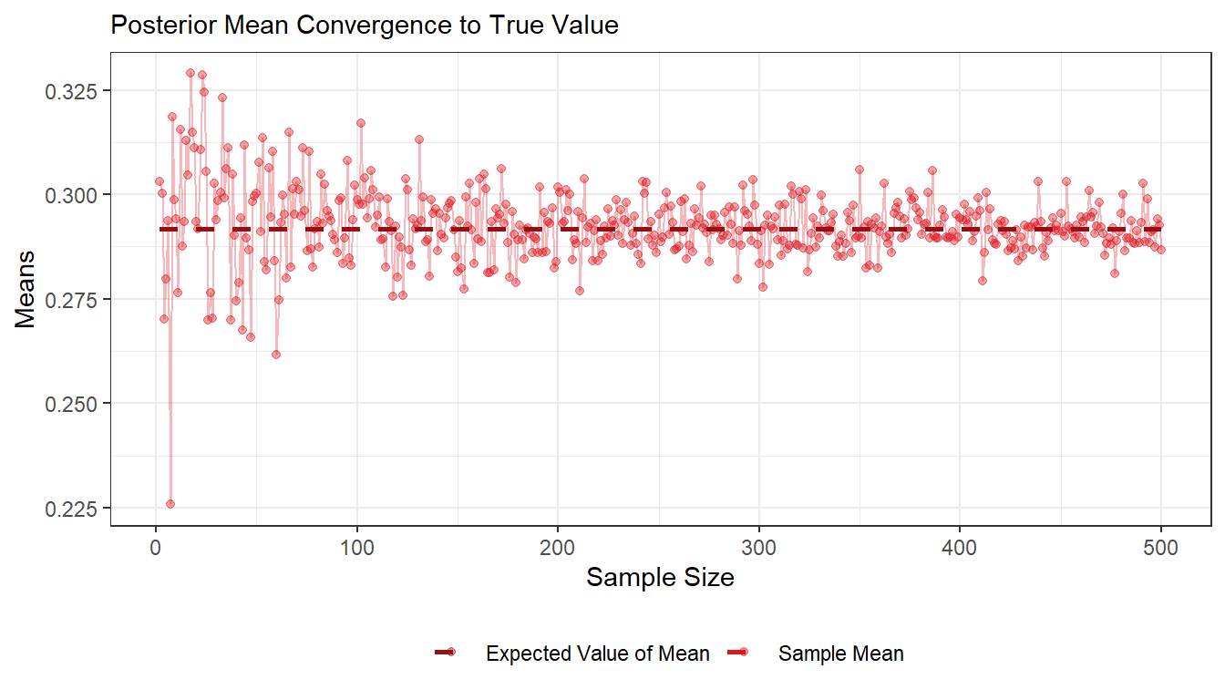
ggplot(df1) +
  geom_point(aes(x = sample_size, y = sample_sd, colour = "Sample S.D."), alpha = 0.4) +
  geom_line(aes(x = sample_size, y = sample_sd), colour = "#3486DF", alpha = 0.3) +
  geom_line(aes(x = sample_size, y = post_sd, colour = "Expected Value of S.D."), size = 1, linetype = 2) +
  labs(subtitle = "Posterior Standard Deviation Convergence to True Value", x = "Sample Size", y = "S.Ds") +
  scale_color_manual(values = c("#113B69", "#3486DF")) +
  theme_bw() +
theme(legend.position="bottom", legend.title = element_blank()) 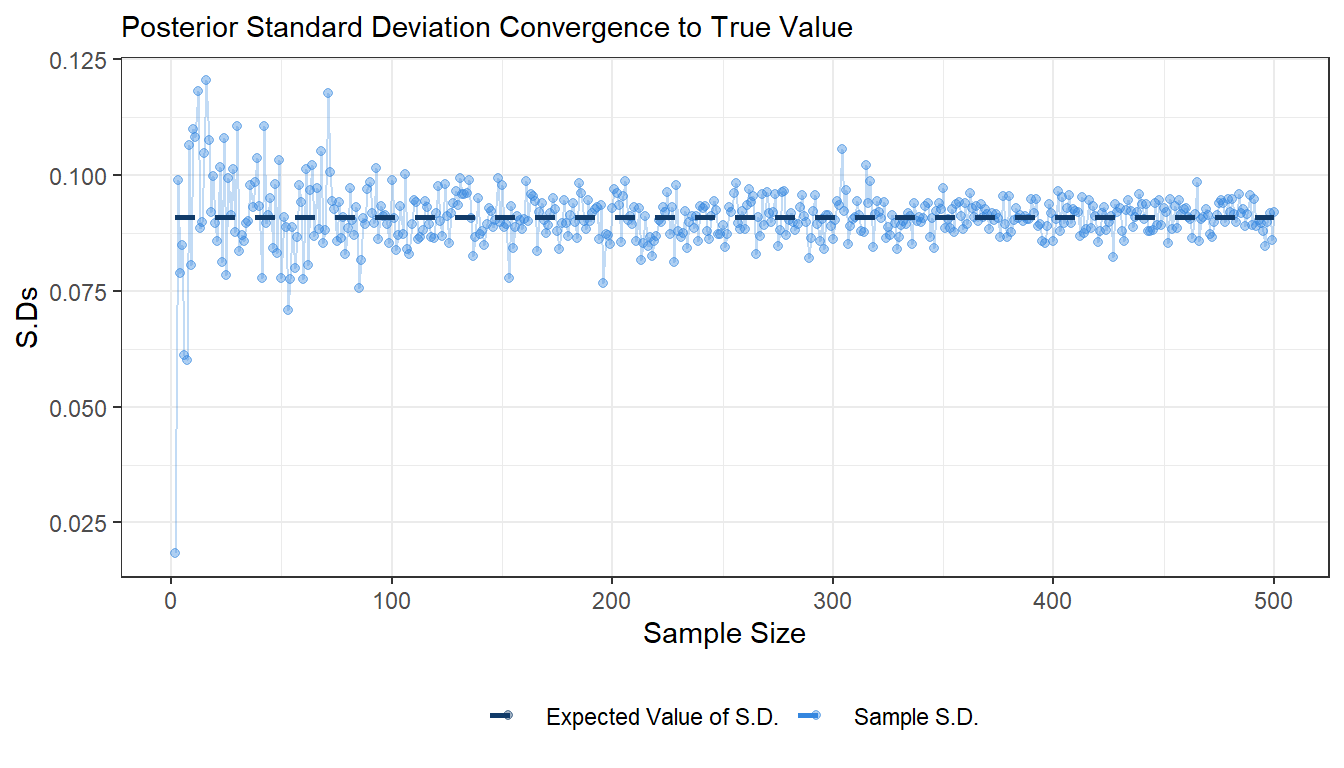
- Use simulation (
nDraws = 10000) to compute the posterior propability \(\text{Pr}(\theta > 0.3|y)\) and compare with the exact value [Hint:pbeta()].
Answer:
We draw a 10,000 sample from the posterior distribution and calculate the average of how many instances have probability above 0.3 in the whole sample and compare it with the 1-0.3 area
## B
set.seed(12345)
sample_1 <- rbeta(10000, a_post, b_post)
post     <- mean(sample_1 > 0.3)
m        <- 1-pbeta(0.3, a_post, b_post)
cat("Computed Posteroir:", post)
## Computed Posteroir: 0.4392cat("Exact Probability:", m)## Exact Probability: 0.4399472- Compute the posterior distribution of the log-odds \(\phi = log\left(\frac{\theta}{1 - \theta}\right)\) by simulation (
nDraws = 10000). [Hint:hist()anddensitymight come in handy]
Answer:
## C
nDraws   <- 10000
set.seed(12345)
sample_2 <- rbeta(nDraws, a_post, b_post)
phi      <- log(sample_2 / (1 - sample_2))

ggplot(as.data.frame(phi)) +
  geom_histogram(aes(x = phi, y=..density..), bins = 40, fill = "#ffffffff", colour = "black", size = 0.2) +
  geom_density(aes(x = phi, y=..density..), colour = "#3486DF", size = 0.7) +
  labs(subtitle = "Posterior distribution of the log-odds",
       y = "Density",
       x = "Log-Odds", color = "Legend") +
  theme_bw()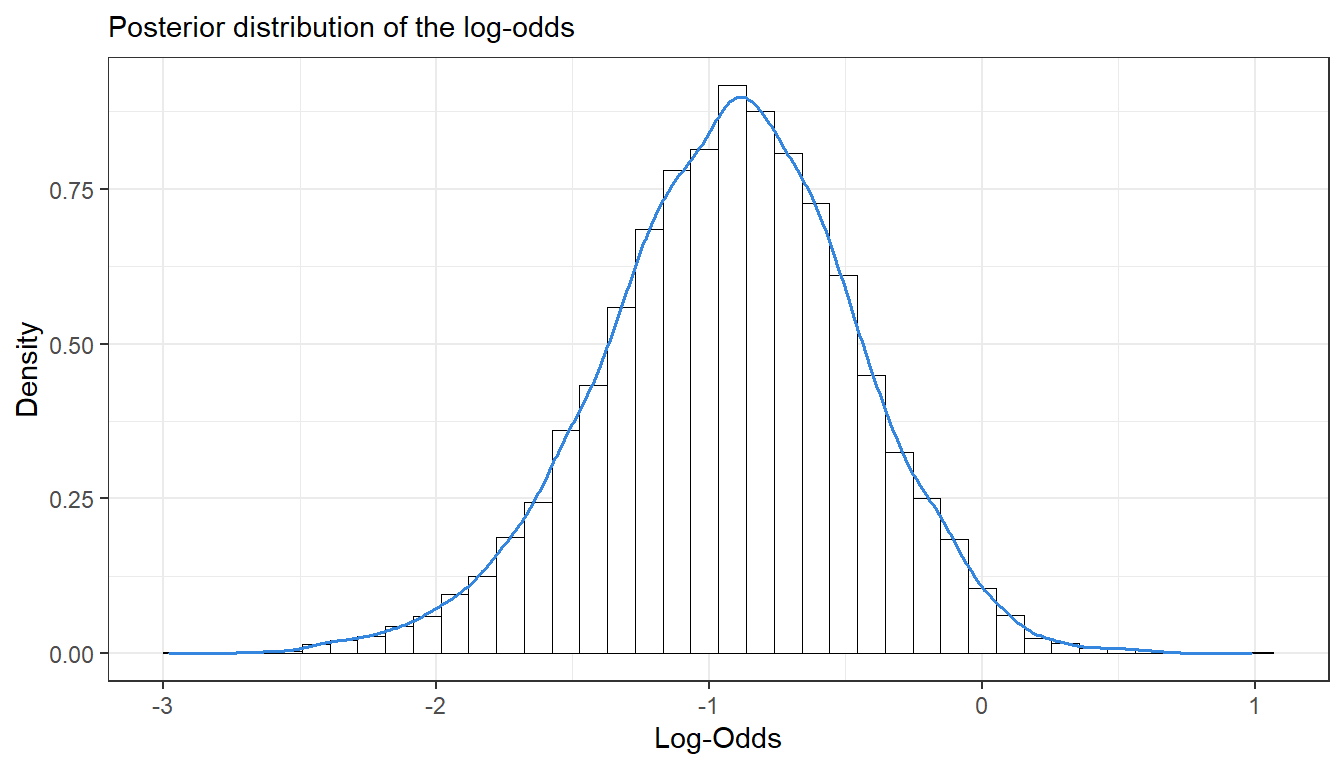
Log-normal distribution and the Gini coefficient.
Assume that you have asked 10 randomly selected persons about their monthly income (in thousands Swedish Krona) and obtained the following ten observations: 44, 25, 45, 52, 30, 63, 19, 50, 34 and 67. A common model for non-negative continuous variables is the log-normal distribution. The log-normal distribution log \(\mathcal{N}(\mu, \sigma^2)\) has density function
\[p(y|\mu, \sigma^2) = \frac{1}{y \cdot \sqrt{2\pi\sigma^2}} \text{exp}\left[ - \frac{1}{2\sigma^2} (\text{log}(y) - \mu)^2 \right]\]
for \(y > 0\), \(\mu > 0\) and \(\sigma^2 > 0\). The log-normal distribution is related to the normal distribution as follows: if \(y \sim log \; \mathcal{N}(\mu, \sigma^2)\) then log \(y\sim \mathcal{N}(\mu, \sigma^2)\). Let \(y_1,...,y_n|\mu,\sigma^2 \overset{iid}{\sim} log \; \mathcal{N}(\mu, \sigma^2)\), where \(\mu = 3.7\) is assumed to be known but \(\sigma^2\) is unknown with non-informative prior \(p(\sigma^2) \propto 1/\sigma^2\). The posterior for \(\sigma^2\) is the \(Inv-\chi^2(n, \tau^2)\) distribution where
\[\tau^2 = \frac{\sum_{i=1}^{n} (\text{log} \; y_i - \mu)^2 }{n}.\]
- Simulate 10,000 draws from the posterior of \(\sigma^2\) (assuming \(\mu\) = 3.7) and compare with the theoretical \(Inv-\chi^2(n, \tau^2)\) posterior distribution.
Answer:
\[\color{mycolor}{ PDF = \frac{\tau^v \cdot \frac{v}{2}^{\frac{v}{2}}}{\Gamma (\frac{v}{2})} \cdot x^{-(\frac{v}{2} + 1)} \cdot exp(-\frac{v \cdot \tau^2}{2x})}\]
######################################################################################
## Log-normal distribution and the Gini coefficient.
######################################################################################

## A
y      <- c(44,25,45,52,30,63,19,50,34,67)
n      <- length(y)
mu     <- 3.7
tau_sq <- sum((log(y)-mu)^2)/n
nDraws <- 10000

suppressPackageStartupMessages(library(geoR))
suppressPackageStartupMessages(library(LaplacesDemon))

inv_chi_pdf <- function(x, v, tau_sq){
  pdf <- (tau_sq^v * (v / 2^(v/2)) / gamma(v / 2)) * (exp((-v * tau_sq) / (2 * x)) / x^(v/2 + 1))
  return(pdf)
}
# inv_chi_pdf <- function(x, v, tau_sq){
#   pdf <- ((tau_sq * v / 2)^(v/2) / gamma(v / 2)) * (exp((-v * tau_sq) / (2 * x)) / x^(v/2 + 1))
#   return(pdf)
# }

X <- seq(0.1, 2, length = nDraws)
# We can use either the builtin function dinvchisq() in the geoR library or our inv_chi_pdf() to draw the PDF.
theo_var1 <- geoR::dinvchisq (X, df = n, scale = tau_sq)
theo_var2 <- LaplacesDemon::dinvchisq (X, df = n, scale = tau_sq)
theo_var3 <- inv_chi_pdf(X, n, tau_sq)
# We can also use the rinvchisq() simulation with very large nDraws to draw the PDF withough using dinvchisq() or inv_chi_pdf()
#X <- rinvchisq(nDraws,n-1)

inv_chi <- function(nDraws, df, tau_sq){
  chi <- rchisq(nDraws, df)
  Var <- (df * tau_sq) / chi
  return(Var)
}
post_var <- inv_chi(nDraws, n, tau_sq)


df2 <- data.frame(X, post_var, theo_var1, theo_var2)

ggplot(df2) +
  geom_histogram(aes(x = post_var, y=..density..), bins = 40, fill = "#ffffffff", colour = "black", size = 0.2) +
  geom_density(aes(x = post_var, y=..density.., colour = "Posterior"), size = 0.5) +
  geom_line(aes(X, y = theo_var2, colour = "Theoretical"), size = 0.5) +
  labs(subtitle = "Simulated Posterior Distribution in Comparesion with Theoretical Density Distribution",
       y = "Density",
       x = "Variance", color = "Legend") +
  scale_color_manual(values = c("#DD141D", "#3486DF")) +
  theme_bw() +
theme(legend.position="bottom", legend.title = element_blank()) 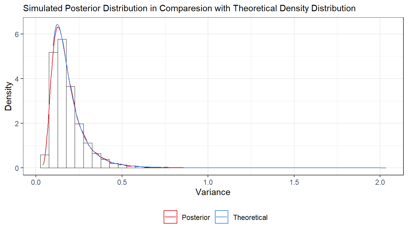
- The most common measure of income inequality is the Gini coefficient, G, where \(0 \leq G \leq 1\). \(G = 0\) means a completely equal income distribution, whereas \(G = 1\) means complete income inequality. See Wikipedia for more information. It can be shown that \(G = 2\Phi(\sigma/\sqrt{2})-1\) when incomes follow a \(\text{log} \;\mathcal{N}(\mu, \sigma^2)\) distribution. \(\Phi(z)\) is the cumulative distribution function (CDF) for the standard normal distribution with mean zero and unit variance. Use the posterior draws in a) to compute the posterior distribution of the Gini coefficient G for the current data set.
Answer:
## B
G <- 2 * pnorm(sqrt(post_var/2)) - 1
ggplot(as.data.frame(G)) +
  geom_histogram(aes(x = G, y=..density..), bins = 40, fill = "#ffffffff", colour = "black", size = 0.2) +
  geom_density(aes(x = G, y=..density..), colour = "#DD141D", size = 0.5) +
  labs(subtitle = "Gini Index",
     y = "Density",
     x = "G") +
  theme_bw()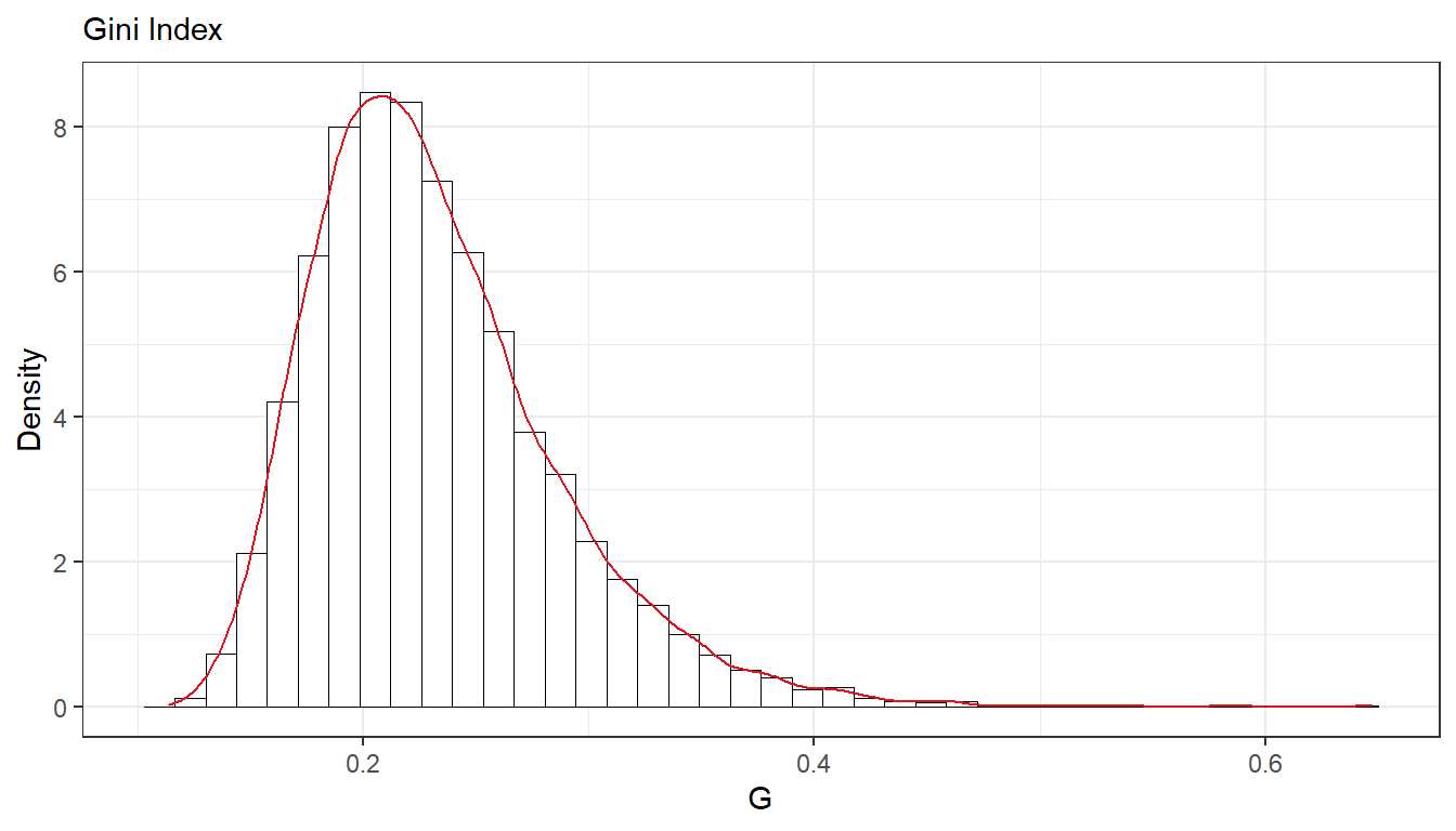
- Use the posterior draws from b) to compute a 90% equal tail credible interval for G. A 90% equal tail interval (a, b) cuts off 5% percent of the posterior probability mass to the left of a, and 5% to the right of b. Also, do a kernel density estimate of the posterior of G using the
densityfunction in R with default settings, and use that kernel density estimate to compute a 90% Highest Posterior Density interval for G. Compare the two intervals.
Answer:
## C
# https://stackoverflow.com/questions/4542438/adding-summary-information-to-a-density-plot-created-with-ggplot
# suppressPackageStartupMessages(library(ggdistribute))

q5  <- quantile(G,.05)
q95 <- quantile(G,.95)
dS <- density(G)
dn <- sort(dS$y/sum(dS$y),index.return=TRUE);
dnn <- cumsum(dn$x)
HPDind <- sort(dn$ix[dnn > .1])
q5_hdi  <- min(dS$x[HPDind])
q95_hdi <- max(dS$x[HPDind])
# q5_hdi  <- hdi(G, prob = 0.90, warn = TRUE)[1]
# q95_hdi <- hdi(G, prob = 0.90, warn = TRUE)[2]
dens <- density(G)
G_df <- data.frame(x = dens$x, y = dens$y)

cat("Equal Tail Interval:", q5, "-", q95)
## Equal Tail Interval: 0.1603999 - 0.3343108cat("Highest Density Interval:", q5_hdi, "-", q95_hdi)## Highest Density Interval: 0.1482621 - 0.3153302ggplot(as.data.frame(G)) +
geom_histogram(aes(x = G, y = ..density..), bins = 40, fill = "#ffffffff", colour = "black", size = 0.2) +
geom_density(aes(x = G, y = ..density..), color = '#DD141D', size = 0.5) +
geom_area(data = subset(G_df, x >= q5_hdi & x <= q95_hdi),
aes(x=x,y=y, fill = 'HDI'), alpha = 0.2) +
geom_area(data = subset(G_df, x >= q5 & x <= q95),
aes(x=x,y=y, fill = 'Equal Tail'), alpha = 0.2) +
geom_segment(x = q5,
xend = q5,
y = 0,
yend = approx(x = G_df$x, y = G_df$y, xout = 3.6)$x,
colour = "#DD141D",
size = 0.4,
linetype = 2) +
geom_segment(x = q95,
xend = q95,
y = 0,
yend = approx(x = G_df$x, y = G_df$y, xout = 1.25)$x,
colour = "#DD141D",
size = 0.4,
linetype = 2) +
geom_segment(x = q5_hdi,
xend = q5_hdi,
y = 0,
yend = approx(x = G_df$x, y = G_df$y, xout = 1.83)$x,
colour = "#3486DF",
size = 0.4,
linetype = 2) +
geom_segment(x = q95_hdi,
xend = q95_hdi,
y = 0,
yend = approx(x = G_df$x, y = G_df$y, xout = 1.82)$x,
colour = "#3486DF",
size = 0.4,
linetype = 2) +
labs(subtitle = "90% Credible Interval",
y = "Density",
x = "G") +
scale_fill_manual(values = c("#DD141D", "#3486DF")) +
theme_bw() +
theme(legend.position="bottom", legend.title = element_blank()) 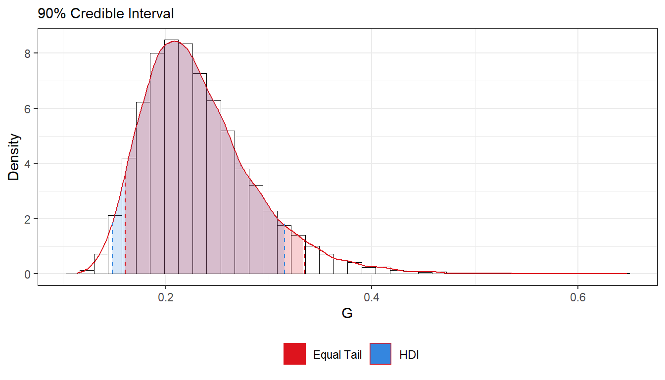
#ggplot(as.data.frame(G), aes(x = G)) +
   #geom_posterior(ci_width = 0.90, interval_type = "ci", color = "red")
   #geom_posterior(ci_width = 0.90, interval_type = "hdi")
# https://cran.r-project.org/web/packages/ggdistribute/readme/README.html
Bayesian Inference
Bayesian inference for the concentration parameter in the von Mises distribution. This exercise is concerned with directional data. The point is to show you that the posterior distribution for somewhat weird models can be obtained by plotting it over a grid of values. The data points are observed wind directions at a given location on ten different days. The data are recorded in degrees:
\[(40, 303, 326, 285, 296, 314, 20, 308, 299, 296),\]
where North is located at zero degrees (see Figure 1 on the next page, where the angles are measured clockwise). To fit with Wikipedias description of probability distributions for circular data we convert the data into radians \(-\pi \leq y \leq \pi\). The 10 observations in radians are
\[(-2.44, 2.14, 2.54, 1.83, 2.02, 2.33, -2.79, 2.23, 2.07, 2.02).\]
Assume that these data points are independent observations following the von Mises distribution
\[p(y|\mu,\kappa) = \frac{\text{exp}\left[\kappa \cdot \text{cos}(y - \mu) \right]}{2\pi I_o(\kappa)}, -\pi \leq y \leq \pi\]
where \(I_0(\kappa)\) is the modified Bessel function of the first kind of order zero [see ?besselI in R]. The parameter \(\mu (-\pi \leq y \leq \pi)\) is the mean direction and \(\kappa > 0\) is called the concentration parameter. Large \(\kappa\) gives a small variance around \(\mu\), and vice versa. Assume that \(\mu\) is known to be 2.39. Let \(\kappa \sim \text{Exponential}(\lambda = 1)\) apriori, where \(\lambda\) is the rate parameter of the exponential distribution (so that the
mean is \(1/\lambda\)).
- Plot the posterior distribution of \(\kappa\) for the wind direction data over a fine grid of \(\kappa\) values.
Answer:
\[\color{mycolor}{p(\kappa) =\lambda \cdot e^{-\lambda \kappa}}\] \[\color{mycolor}{p(y_i \mid \mu,\kappa) = \prod_{i=1}^{n} \frac{\exp\left(\kappa\cdot cos(y_i-\mu)\right)}{2\pi I_0(\kappa)}= \frac{\exp\left(\sum_{i=1}^{n}\kappa \cdot cos(y_i - \mu)\right)}{\left(2\pi I_0(\kappa)\right)^n}}\]
\[\color{mycolor}{p(\kappa \mid y_1,y_2,...,y_n) \propto \frac{\exp\left(\sum_{i=1}^{n}\kappa \cdot cos(y_i - \mu) - \kappa\right)}{\left(I_0(\kappa)\right)^n}}\]
######################################################################################
## Bayesian Inference
######################################################################################

## A
y  <- c(-2.44, 2.14, 2.54, 1.83, 2.02, 2.33, -2.79, 2.23, 2.07, 2.02)
k  <- seq(0.01, 10, by = 0.01)

prior <- function (k, lambda = 1) {
  return(dexp(k, rate = lambda))
}

likelihood <- function(data, k, mu = 2.39){
  n <- length(data)
  return(exp(k * sum(cos(data-mu))) / (2 * pi * besselI(k, 0))^n)
}

posterior <- function(data, k, mu = 2.39){
  n <- length(data)
  return(exp(k * ((sum(cos(data-mu)) - 1))) / (besselI(k, 0))^n)
}

prior_data <- prior(k)/sum(prior(k))
like_data  <- likelihood(y,k)/sum(likelihood(y,k))
post_data  <- posterior(y,k)/sum(posterior(y,k))
wind_df    <- data.frame(k = k, prior = prior_data, likelihood = like_data, posterior = post_data)
post_mode  <- wind_df[which.max(wind_df$posterior),c(1,4)]

#windowsFonts(Calibri=windowsFont("Calibri"))
library(ggplot2)
ggplot(wind_df)+
  geom_line(aes(x = k, y = prior, colour = "Prior"), size = 0.5) +
  geom_line(aes(x = k, y = likelihood, colour = "Likelihood"), size = 0.5) +
  geom_line(aes(x = k, y = posterior, colour = "Posterior"), size = 0.5) +
  geom_point(aes(x = post_mode[[1]], y = post_mode[[2]]), color = "#970E14", size = 1.5, shape = 23, fill = "#DD141D") +
  geom_label(aes(x = post_mode[[1]]+1.3, y = post_mode[[2]]+0.0005, label = "Posterior Mode")) +
  labs(title = "Prior vs Likelihood vs Posterior", x = "k", y = "density") +
  scale_colour_manual(breaks = c("Prior", "Likelihood", "Posterior"), values = c("gray", "#DD141D", "#3486DF")) +
  theme_bw() +
theme(legend.position="bottom", legend.title = element_blank()) 
- Find the (approximate) posterior mode of \(\kappa\) from the information in a).
## B
cat("Posterior mode:", post_mode[[1]])
## Posterior mode: 2.12
The wind direction data. Angles are measured clock-wise starting from North.